iPhone Duo Review: First Generation Fun!
In a Nutshell
The iPhone Duo is a polished first-generation foldable with excellent hardware details like a variable-weight hinge, nano-texture inner display, and clever continuity animations, but it's held back by being thicker/heavier than competitors, lacking Face ID, and having many unoptimized apps that look poor on the large screen. Battery life is strong and the dual-app multitasking and half-open modes are genuinely useful, but most big third-party apps won't feel native for months. At $2,000, it's worth it only for people who specifically want a pocket-sized iPad Mini experience and aren't deterred by the first-gen compromises.
These notes were generated by AI and may contain inaccuracies.
First generation devices are always the most fun to review. For the past month, everyone has been asking what to think of the iPhone Duo, whether to get a foldable iPhone, and who it is really for. The device has been tested for the past week.
Most new pieces of tech are fundamentally a solid idea at their core and can be a little bit rough around the edges, but that will get better over time. The iPhone Duo as the first folding iPhone is very polished around the edges, but kind of rough in the middle.
Apple does this annoying thing when they come out with new products where they kind of ignore the rest of the world and pretend the competition just doesn't exist. It can be kind of brutal listening to them go up on stage and pretend that they're inventing something and explaining something we've never seen before. For a lot of people, they really actually haven't yet seen this before.
This first folding iPhone is years behind, like eight generations behind the first folding phones we saw back in like 2019. For a whole mass of people, this is the first one they've ever really even considered buying. It forces them to think very deliberately about that question and forming a cohesive, understandable reason why they should spend $2,000 on this.
The animation between the closed and opened Duo displays is not just good because it's smooth, but because it's literally teaching first-time foldable users what is happening. It was likely inspired by a lenticular sheet, which is pretty cool. When the sheet is on top of something, you start to lift it up and it slowly diffuses what's underneath it.
When you start opening the iPhone Duo, it slowly diffuses what's underneath it and it's super responsive to the hinge angle as you open or close more for realism. When you get to the open half, all this reflection and this diffusion implies that there's more underneath that. It's all designed to help people intuitively understand that they're opening to reveal an extended display.
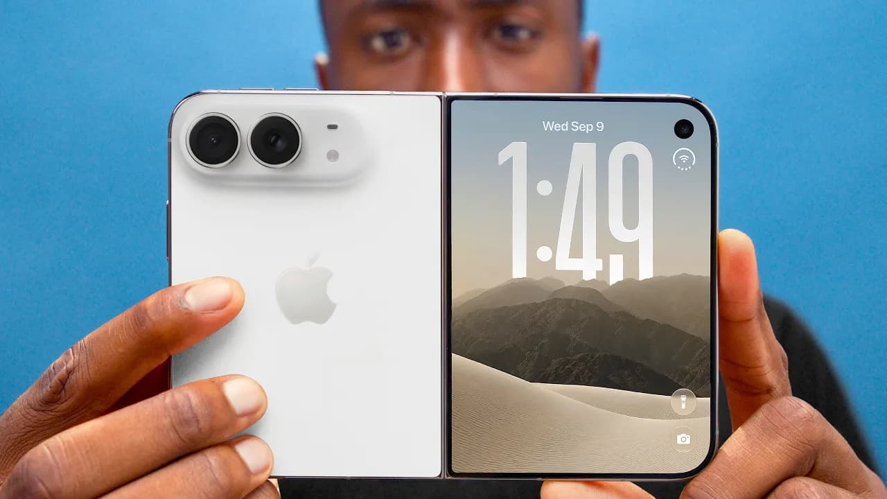
The hardware feels very first gen. It is a very pretty phone, and even though we've seen folding phones for years, it's still pretty striking to finally see a folding iPhone. The back glass is one piece and curves up smoothly onto the camera plateau where the dual cameras sit. The side rails are titanium, very shiny, very premium feeling, also very fingerprinty.
When you open it up, it feels solid because the hinge weight is actually variable. Right at the point of opening when you're prying the magnets apart, it's really sturdy. Then it smoothly opens to like halfway. Then it slows down again so it can stop at various half-open states for certain apps. The last bit snaps open. The same thing happens when you're closing it. There's some real effort required at first, and then the reward is that satisfying clap shut with the magnets.
The iPhone Duo has an IP68 dust and water resistance rating, which is pretty elite for a foldable. You can splash it, you can toss it in your bag. It is treated like a regular phone, minus never taking it to the beach because these things don't like sand.
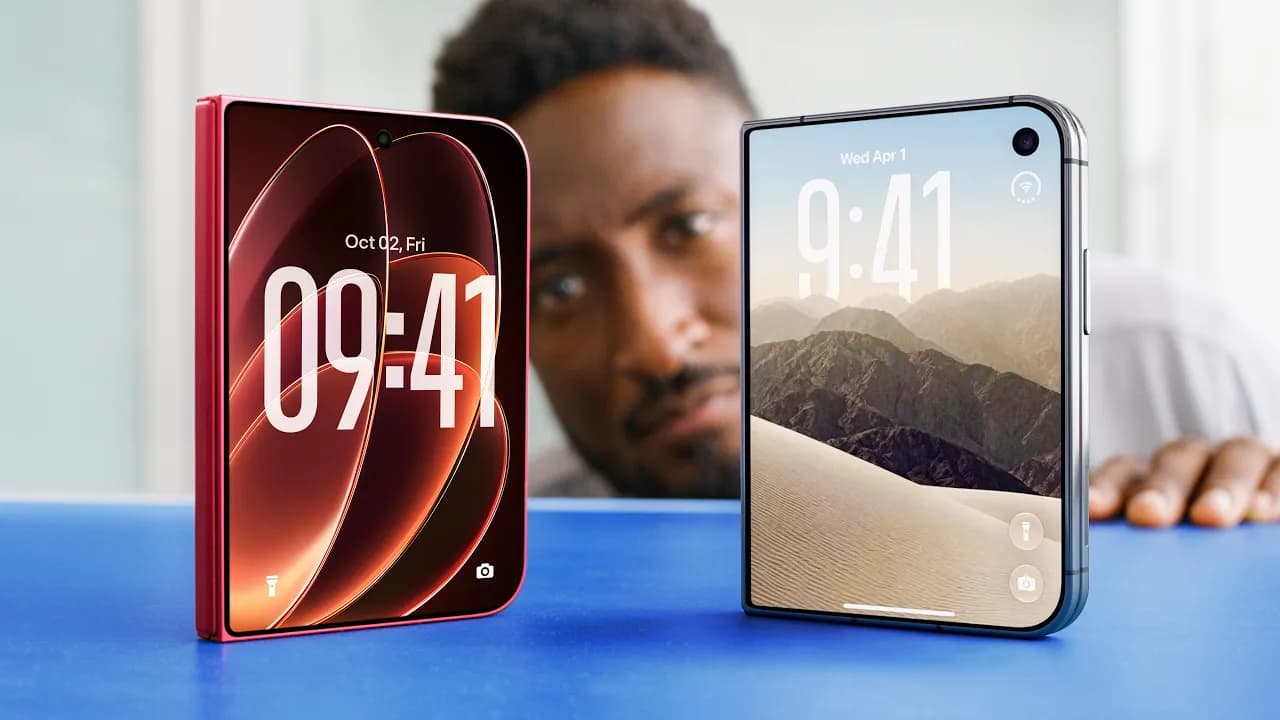
The iPhone Duo is compared to a Samsung Z Fold 8, which is now Samsung's eighth year doing foldables. The Samsung device is significantly thinner and like 20-some percent lighter. The sides being flatter makes it much easier to pry open than the slick, rounded titanium sides. After using the Duo for like a week or two, it would be preferable if it was 20% lighter.
John Turnis recently called a bunch of the other foldables cheap and crappy. Making everything metal and glass and heavy doesn't necessarily make it better to use. It feels good in the hand, but it sometimes works against them. It's just kind of the permanent Apple design default. That is great for a MacBook Pro or an old Mac Tower when you want it to feel metal and substantial. But it sometimes backfires like Vision Pro. Vision Pro is all metal, super heavy in a world of all plastic VR headsets.
Vision Pro does feel premium and significant to hold and does kind of at first glance make the other plastic ones feel cheap and crappy. But when wearing it on your face for a while, it would be preferable if it was lighter. The same applies to over-ear headphones. Most are plastic for a reason because it's lightweight. AirPods Max comes along very premium, feels solid, it's metal, very heavy, maybe a little bit too heavy.
This reminds of the first generation Pixel Fold. Just a little thicker and heavier than hoped, but clearly the right idea.
This is a very right-handed phone. The thumb naturally rests right on the fingerprint reader/power button when held that way. But then camera control is kept all the way down near the bottom right corner. It's a little out of the way, but maybe it's also rotating into taking a photo or a video, so it's not bad. That also means there's not quite enough room for the volume buttons on that side, so they put them at the top of the phone, again just slightly out of the way.
In iOS 27.1, pulling down from the right corner still accesses control center. Pulling down from the middle anywhere is Siri, which means all the way to the left, that top left corner is where you pull down to get notifications. Even with big hands, that's just a little bit of extra hand gymnastics.
Apple made two first-party cases. The Folio case is $130 and it magnetizes to the back and then kind of slides to expand to cover the front. It's a one piece case. The kickstand is cool, but it leaves the rails totally unprotected. They also made their silicon case. Two pieces, one for the back, one for the front, but this one leaves the hinge totally exposed.
The dbrand Grip case is $60. It has done a better job than Apple at making something that's actually protective with the back hinge protection piece. This doesn't use mechanical parts like most folding cases. No moving parts, just one integrated piece. If paranoid about durability and wanting the cleanest looking case that actually has hinge protection, this is probably the best move. The whole Duo lineup with this case and the prism screen protector is available at dbrand.com/duo or nationwide at Best Buy.
The inside screen does not feel first generation at all. This is a 7.6 inch OLED, 120 Hz display. It matches the 3000 nits of the outside display. The nano-texture finish is so good. It does a great job of hiding the already mostly imperceptible crease, but it also just feels nice to slide your finger across it.
The nano-texture micro lenses are absolutely tiny. There is a cutout in the nano-texture for the under-display selfie camera. The nano-texture does slightly diffuse the light, so there's a little bit less sharpness when reading text or watching videos, but at no point was that found to be bad.
The under-display selfie camera is very first gen and it is bad. The photo quality is trash. It looks a little better on a FaceTime call with video than just straight up taking pictures with it. Apple has clearly done the math and assumed people won't use this camera very much and have accepted the trade-off of image quality versus having this big dramatic uninterrupted inner display.
The hinge with variable weight is excellent. Battery life is really good. The battery is about a 4,900 mAh combined battery split between the two sides. If using the phone at the normal ratio of like 75% closed, 25% big screen open, this is going to be an all day phone and then some. The 2nm A20 Pro chip is doing a lot of heavy lifting and performs great, but it's also super efficient. It feels right on par with the 17 Pro. With a ton of high brightness use, regularly ending the day with like 30 plus% left. If doing way more big screen use, it'll be a bit more battery because it's the bigger display, but honestly, not much. It's a very efficient phone.
The cameras on the back are right on par with the rest of the foldables out there. There are dual cameras, one standard 48 megapixel and one ultrawide. The literature actually seems to point more towards using the same camera as the iPhone 17e. It is capable of taking really good photos, but it does mean that as lighting conditions deteriorate, this smaller sensor does have to crank up the ISO earlier and get noisier earlier than those bigger pro cameras.
After taking a lot of photos and videos over the course of the past week and a half, almost none of them have surprised. It's a solid camera. It's an okay camera most of the time. The ultrawide is like baseline useful to have, but it's not going to take incredible corner to corner sharp photos. Not having a zoom does mean that shots past about 4x are just dramatically worse than the Pro phone, which has an actual zoom.
Side by side with a 17e and an 18 Pro in weaker lighting, it's definitely closer to the 17e in terms of sharpness and noise. The entire Tesla Roadster reaction video was shot on the iPhone Duo, and there were almost no comments about it. The Duo, despite having a Pro chip, doesn't have any of the pro camera features. There's no ProRes, there's no log. It's just good old-fashioned 4K 30. And it generally looks fine. It's outdoors. Of course, the footage is usable. This is not the iPhone you would choose if you are the iPhone filmmaker who wants the absolute best possible pro tools and image quality.
It gains the ability to turn on the rear display for the camera. With a button, the preview can be fired up, which just shows the people being taken pictures of the exact framing that is being used. This is called spouse mode. When a spouse asks to take a picture of them, they don't have to ask five or six times. They can just give instructions to get it perfect the first time.
Kid Q plays colorful Snoopy themed animations on the back, which should ideally get little kids to kind of look in the general direction of the phone while taking a picture of them. This is called kid mode.
Flipping the phone around shows a slide to open camera control. Sliding that not only gives the preview, but gives all the controls to take the highest quality possible selfie with the main camera on the back. It also disables the back display to reduce accidental touches. This is called self-portrait mode.
The bottom line is the hardware is fun. It is really fun. What's not fun though right now is the apps.
The app situation on the iPhone is its biggest downside right now. While closed, the iPhone Duo is basically a normal iPhone on the left hand side, but anything that would typically be at the very top or the bottom is moved over to the right where it's reachable with the right thumb. On the home screen, there's a normal grid of apps on the left, but the dock from the bottom moves over to the right. The time and the battery and cell signal, all that stuff is also over to the right in this clever little glyph.
Opening one of Apple's own apps continues the theme where the main content is on the left and then the buttons that used to be on the bottom or the top are over to the right where they're reachable. This is a brilliant concept. It's cool. It's sort of the blueprint for an optimized app. The problem is most apps, at least most of the ones used right now, are not optimized yet, which means they look like a regular app with the buttons still at the top and the bottom and then a black bar down the right hand side where the buttons are supposed to be.
Spotify looks unoptimized. Google Maps, Waze, Discord, and Twitter are all like this. Google Calendar is like this. Tons and tons of apps, big apps. Most of them are currently like this. When opening up the phone, they're mostly still just small unoptimized iPhone apps in the middle of this huge screen. Even if turned vertical, still very small. Very reminiscent of the old iPad days where you could just hit the 2x button and it just made it bigger.
Some apps are slightly more responsive, like they'll partially kind of stretch out across this inner display, but they're still clearly not optimized for Duo yet. Spotify kind of stretches things. Flighty kind of stretches things. The general experience has been flipping between a whole bunch of not optimized apps that look pretty terrible on the Duo right now.
In about 6 months once developers get a bunch of these and start developing the Duo specific versions of their apps, things will start feeling way better. This isn't just an iPad app. It's a Duo app that they have to make. This is one of Apple's biggest strengths, just dragging developers along for stuff like this. Most of the big ones will come along for the ride eventually. But not all of them will. Arc Mobile will have to be officially abandoned as the browser of choice because they're done developing that for mobile. The gym app that is used every day is probably not going to get updated.
Instagram just got the update with all their stuff together for close screen where buttons are on the right hand side now. When opened up, they have the two columns. Buttons are still reachable on the right. Carrot Weather, the weather app of choice, also got the update. Hopefully more get on this page soon.
This has been kind of a buggy phone to test. There have been a couple of things like freeze up. Not full catastrophic restart the whole phone freezes, but a couple weird bugs, especially in that continuity animation. If slowed way down or even stopped halfway and then trying to interact with the display, it can get kind of confused. Mainly because there's so many different possible states that it could be in that it's trying to figure it out, like the hinge angle and the orientation, like should it be standby mode, should it be between the apps on the right or the left.
The biggest software gripe is actually not a bug. It's an intentional feature. This phone doesn't have Face ID because there's not enough Z-axis space, not thick enough. They've done what all the other foldables have done, which is add a fingerprint reader on the power button. But they've programmed in a delay on that fingerprint reader.
If just wanting to check the lock screen real quick, using the registered finger is actually too fast because it just unlocks right away and skips the lock screen. To check lock screen notifications, instead just tap with a different finger so it doesn't unlock and then you can read whatever. When wanting to unlock, then use the correct finger again and it opens up.
With iPhone Duo, Apple built in a delay with every single unlock. You can tap with your registered finger, it pauses on the lock screen for a beat, and then if you keep holding, then it unlocks. It's technically smart because it's giving people a chance to check to see their notifications real quick before it goes and unlocks it. And if they want to deliberately hold it longer, it'll unlock. But as someone who's used to the instant unlocks from Face ID, it was needed to find a way to turn this off, and that was not found.
This new behavior taught is that you can speed it up by waking it then swiping up then touching the fingerprint reader and it unlocks basically instantly. It's really fast. Face ID is going to be the number one thing people miss coming from other iPhones. Not the zoom cameras, not the thinner and lighter form factors. It's Face ID.
Most new products have this good idea somewhere at the core, and then they can be a little bit rough around the edges, and that will get patched up and better over time. iPhone Duo is very polished around the edges with all these sleek animations and all this stuff, but it is a little bit rougher at the core, like just being a little thicker and heavier and having a bunch of apps not look good.
There are going to be people who this phone is really good for because this phone is really good at a few things. The obvious one is two apps side by side. There are tons of good reasons to do that. YouTube open on one side and note-taking open on the other side is very useful. Or maybe just replace YouTube with something else like a video call or anything really. Also copying and pasting like an email confirmation code from one side into a login portal on the other side is also extremely clutch.
If you have two apps open side by side and then tap on the divider in the middle, it locks them together in a pair and visually looks like a book. Anytime you open one, they both open up together. Then you can unpair it the same way. The back and forth with all the different windows is super intuitive. You can go home on one side, not the other. Then you can swipe between recent apps on one side but not the other. It's all super clean. You can't do a third window and you can't do anything other than two apps side by side half screen, but that's of course still better than a regular iPhone.
Scrolling Instagram reels and TikTok at the same time is possible technically, but it actually does kind of bug out a little sometimes because it wants to only play the audio from one and then it kind of gets weird. You can't hear both at once.
The halfway open state is actually really good at, better than a lot of other foldables, because this hinge is so sturdy in the middle that it's probably the best foldable at just being partially open. They've planned around that. If typing but then like sort of partially close it, the keyboard splits in half to avoid having to touch the middle. There are also apps that let you type or control on one half of the screen while you have content playing on the other half.
This is the first iPhone that automatically enters standby mode even when it's not connected to power. When just put up in like a tent formation, when it's vertical, it'll just show two different customizable screen savers. And when it's in horizontal, it'll show one big screen saver like your clock or weather or calendar or whatever you want. It's really nice. The phone has more than enough battery to sort of just sit on a desk all day showing notifications and not have any issues. There is of course the sort of awesome underglow alarm clock.
It does the continuity thing incredibly well. The speed that it goes from open to closed and closed to open and picks up exactly where you left off is excellent. You could be in the middle of writing an email with an attachment this whole big thing and you realize you want to do a little more multitasking to get this done. You just open the phone and keep it going. It just picks up right where you left off. You could be in the middle of reading something, open the phone mid scroll and it finishes that scroll and keeps going. It's so good.
The matte inner display can't say enough nice things about. It is the hardware highlight of the Duo. It's nice to read
It's nice to read things on. It's nice to watch videos on. It really blocks reflection super well. And it's nice to hold it vertically like an iPad Mini. Matter of fact, this is the orientation that the volume buttons on the side make more sense. And I find myself holding it like this reading stuff more than any other foldable I've used. But most of all, the polish at the edges helps people to understand what is happening on the phone. The open and closing animation, the two apps next to each other animation, the new dynamic island animation since it's over here on the side. Also, the inner display selfie camera when you close the camera app just shrinks up the pixels to hide the camera. That is so clean. The condensed battery time and signal strength indicator over in the corner has become very easy to read and I've gotten used to it. The dots at the bottom are your cell signal strength. It's all very well put together. And it's not a coincidence that the camera viewfinder fills up the whole display perfectly with no black bars because the camera sensor is the same aspect ratio as the outer screen, which is also the same aspect ratio as the inner screen rotated 90°. So, it always fills up your display. Such a nice touch.
I know that a lot of people when they see that there are chapters in this video and there's a conclusion chapter, they're going to skip right to this part of the video. Shame on you for skipping, watch the rest of the video. There's so much other good stuff in there. But okay, fine. I get it. Your finger is hovering over the order button and you just need someone to tell you if it's good or not. First of all, I do think that by the time you actually get your Duo, if you're just now going to order in a couple weeks and months, there should be way more apps optimized for the Duo. That's nice. But yeah, the idea is really simple in concept, right? It's $2,000 to get an iPad mini that can fit in your pocket. 120 Hz iPad Mini OLED fits in your pocket. Have you ever wanted that? They made it. They did it. Great. This is the first generation. It's made for you. But also, yeah, it is polished but rough.
There's going to be a lot of attention on this phone because it's a new iPhone. And people with other iPhones are always curious if they should be getting the newest iPhone. And for most of those people, the answer is probably actually no. Like if you're just a regular person who doesn't do much more than texting and social media on their phone, some occasional web browsing here and there, like probably no. If you are the iPhone filmmaker who wants the absolute best cameras to go shoot their next thing, no. If you're the type of person who breaks your phone every like nine months cuz you drop it all the time, yep, probably no. But if the $2,000 or the difference between 35 and 55 bucks a month doesn't mean much to you and you just kind of like the idea and want to jump in, I think after the learning curve and getting used to not having Face ID, this is a really fun phone to use. And it's really just cuz that polish, that polish around the edges goes a long way towards the fun factor. So, the awesome animations, the incredible hinge, the wonderful inside display, like all of that is just really nice and it hides a little bit of the rough core. Like, it will feel a little heavy sometimes and not all your favorite apps will be updated right out the box, but it is fun.
Apple can't completely engineer their way around the compromises of this form factor, like the slightly worse battery and the slightly worse speakers and the slightly worse cameras. Like, that's just physics. But what they have done is an admirable job with their first generation. Now, I'm just going to have to cross my fingers that second generation actually listens to some of that core feedback cuz that could be an amazing phone. If you are picking up this first gen duo, though, it's also a good time to pick up some extras while you wait for it to arrive.
First of all, their power bank. It's a 5 in one 10,000 milliamp hours MagSafe, built-in cables, an Apple Watch charging pad, and it works as a hub while unplugged in. It'll work with your new phone or your old one. And then second, their tracker card. It's the size of a credit card, so it slips right into your wallet, and it works with both Apple Find My and Google Find Hub. The battery lasts up to 10 months per charge, and it charges wirelessly. Ridge's friends and family sale is on now, and you know, I consider y'all friends and family. So, you can get three power banks for the price of two. It'll work with your new phone like the iPhone Duo or 18 Pro or any phone with USB type-C or lightning cables. Head over to ridge.com/mkbhd to check out that deal before it's gone for good.
Keep Marques Brownlee in your library
Save the videos and channels worth coming back to, and find them again in one place.