GPT 6 + Hyperframe = Crazy combo for expert-level videos
In a Nutshell
The video demonstrates how Hyperframe enables AI to generate expert-level product launch videos by using HTML/CSS/JS instead of traditional editing software, allowing models to understand and edit every frame precisely. The creator shows a complete workflow of building a Codex Track plugin launch video from scratch through iterative feedback on storylines, layouts, and animations, achieving professional results in about 1.5 hours. The key takeaway is that video quality depends entirely on detailed, frame-by-frame guidance rather than the tools themselves.
These notes were generated by AI and may contain inaccuracies.
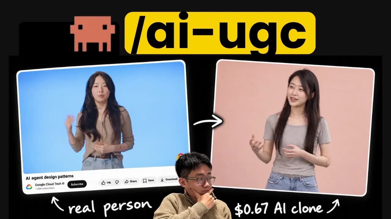
Thank you to HubSpot for sponsoring this video. When we talk about AI-generated product launch videos like Hyperframe or Remotion, many people think that these are very boring and uninteresting videos that look like PowerPoint slides. But the situation has changed dramatically in the last few months with the arrival of models like Fable. GPT-6 Astra's video editing capabilities have come a long way since its introduction. It's beyond all imagination. For example, I put this video I downloaded from YouTube into Astra via Hyperframe. It produced the video pixel-perfectly in just 32 minutes, which is truly incredible because there were so many intricate visual details to work out.
I personally use Fable and Astra with Hyperframe to create all of my own product launch videos in high quality. I have received over 1 million views with this AI-generated content. The most creative example in my own experience is the Fable 5.1 launch video for my product track. My team saw the announcement of the Framer 5.1 release this morning and decided that we would do a launch with it. We had just 4 hours to prepare the entire launch campaign, which included this high-fidelity video—which doesn't look like PowerPoint at all—and a landing page that didn't look like it was directly coded. We got over 100,000 views on Twitter after preparing everything within 4 hours. This was a week when my team started this type of video-based launch, which skyrocketed our product growth.
If you create and market products, mastering the skills to create launch videos with Hyperframe or Remotion is a must, which will give you a huge competitive advantage. And today I want to talk about this. I'll show you how these frameworks work and how we can create a video from scratch so you can understand my approach.
But before we get to the main discussion, let me say that one of the reasons why frameworks like HyperFrame are able to create amazing videos is because of modern tools like Codex or Cloud Code, which use context cues and other features to fully utilize the power of the model. There can be a 10-fold difference in work results between a typical Prompt user and a skilled user who fully utilizes every tip and trick. And that's why I want to introduce you to this free cloud code playbook I created with HubSpot. It covers the basic principles of prompting agents, as well as how I organize my agent.md and cloud.md files to get the most out of them. Also various hooks and guardrails that I have made, so that my agents really adhere to the SOP. And when I have many sessions running simultaneously, how do I keep long-term tasks on track using task state and different setup layers for each project? Here are some tips and experiences I've learned that have helped me reduce API costs by 70%, while maintaining the same output quality. This is something that would have been nice if I had had time to start. It is completely free. I have provided a link in the description below, you can check it out from there.
Now, let's get straight to how to create that wonderful hyperframe video. The basic idea is that we will create videos using HTML, which is something that the Large Language Model is very good at. This is possible because we now have new frameworks like HyperFrame or ReMotion. Before these frameworks came along, people used to create videos in software like After Effects. Typically, videos are created in that software using a combination of layers, effects, and keyframes. Automation there is only possible through the editors' own APIs, on which the model has not been trained. And more importantly, there is no easy way for the model to understand what the website screen will look like in 1 minute and 3 seconds.
The HyperFrame team initially experimented with JSON or XML to introduce a data structure for describing videos that could output models. But this didn't help the model visualize or understand what each frame looked like. And this makes the model ineffective when it comes to editing and modifying videos. But when they chose the path of HTML, CSS, and JavaScript, the situation changed completely. Because the model is very skilled at writing HTML. So the way HyperFrame works is that it allows the model to display a video timeline in HTML. You can add data composition IDs, determine when this part of the video starts, how long it will last, and place visual elements within divs; As a result, the model can output designs using simple HTML and CSS and control animations using JavaScript, which means it can use animation libraries like GSAP. Just links DOM elements to the video timeline. So it became very easy for the model to capture any frame at any given time. And that is the main function of hyperframe or remotion.
The only difference is that HyperFrame is optimized for HTML, CSS, and JavaScript, while ReMotion is built for React and CSS. So, both work, but I personally think modal is much more creative or freer when it comes to designing things in HTML. Also, Hyperframe comes with many different types of skills or abilities. When you go to install HyperFrame skills, you may find the many skills to be quite complicated. You may not know which one to use, but you should know that I'm introducing two sets of skills. And a must-have skill is the core of this hyperframe. It discusses the core space of Hyperframe and some related skills around it, such as Hyperframe CRI, animation, and keyframes. They also have a HyperFrame Registry, which allows agents to search a large library of different video and animation elements. In addition, they provide some skills based on usage that can be loaded as needed, such as product launch video, faceless explainer, music to video, PR to video.
For example, I used this Website to Video skill and asked it to create a video based on uber.com. And after 21 minutes with just one prompt, it was able to create a video like this. It is completely unbranded, animated around their core UI elements and user journey. But, even after giving the prompts, it still feels like a PowerPoint slide. A little boring, not very interesting. And that's what I want to show you next. Let's create such a launch video step by step from the very beginning. Like a video made in a professional studio.
Let's say I want to create a launch video for the newly released Track plugin for Codex. Next, I will open a new session in our repo and prompt the Codex plugin to create a launch video. Here I specifically say that we will not look at our existing video as a reference, so that we can simulate the experience of creating a video from scratch. I'm using the Astra Hi model here because it's great for video production. So it will ask me this question. I have an idea about the storyline. So I'm prompting that we want to show the UI of the real Codex app which will simulate the user journey of searching, installing the plugin and testing its functionality. So, the first thing it did was offer me a storyline in text form. And if I open it, I can see it. So, entering the Codex plugin directory cursor search, typing track, it's logical. And the product details install state, Codex Composer captures the track using the app's original controls. And the real progress of focusing on search keywords social is complete in the Real Response UI. Okay, that's pretty good.
However, I would like to change the content of the story slightly. The use case highlighted here is basically similar to search keyword social, which is a good practical aspect. But the use case I want to emphasize is this People Search, which we launched on Twitter this week and it's gone viral. So, I want to put more emphasis on this message and the scope of use. I'm saying that the storyline is good and we want to show both SEO and social, but let's start with people search as the foundation. And we have launched a product here as a reference. You can get more information about this using Track, because we have very good social scraping facilities. The agent actually finds our specific page in People Search, which helps get more detailed information, which is great. All in all, it only took 2 minutes to do, and the storyline is looking pretty good now.
But there are some other things I want to talk about. For example, we have repeatedly said in previous videos that you do not have to pay any subscription fees with Track. There is no contract problem here. We basically bundled all the services together and set prices based on usage. So, that's a big part. Secondly, lead enrichment is just one area of use. We actually have a lot more. So, I want to convey these important messages. So, I will give some feedback to the prompt. There are some key value propositions and messages that I want to convey. First of all, with Trak you don't have to pay a subscription, you just pay for usage. Instead of very expensive subscriptions, we charge per coin. Second, we support many use cases, such as 2,800 different data and tools. So, we want to show a view where a large amount of our sellers are displayed. Third, Track People is also number one in search benchmarking. Basically, we have the best people finder for agents based on testing. So, I want to include this message as well. And during the last launch, many people wanted to know if we could get a phone number. And we actually can. In fact, we can get a phone number for just $0.04.
So, I will give him this feedback and ask him to change the storyline a little. What I'm seeing here is that, based on my experience, video production is generally a creative iterative process. That means, even though we create the storyline now, after creating it, we may feel like we need to tweak some things here and there to make the video better. The advantage of HyperFrame is that you may be getting a one-minute video, but the entire video is divided into different parts, making it very easy to change its order. Okay, so update the storyline: people are looking for prospect tables, can you find phone numbers for benchmark proof, team review, vendor explosion, SEO demo, social demo. Okay, that makes sense. Lastly, I want to end with our tagline, which is: Over Router for Data and Tools. Now, I'm very satisfied with the storyline. So, I would now ask it to move forward and move to the next step. We can see that this created the storyline for me. And now you can give feedback for each frame.
Right now, it's better to focus on two things rather than focusing on detailed visuals. The first is the overall layout of the screen. And the second is the copies or writings. You can give feedback on every frame. You can then click this button to copy and re-paste the prompt. So, I'll do it one by one. And this is where I think your taste as a founder or marketer comes into play. Because by default, models like Astro also usually create videos like PowerPoint slides. However, if you give it the right context and direction, it can create something wonderful. So, I'll do it one by one. For the first one, I would say that I don't like this PowerPoint type of layout. Also, I don't like the 'Find your next customers' text on the left, because it only sticks to one use case. Although that is important, I don't want to do that. And besides, let's start with the Codex Mac App UI, then search for installed plugins. We'll decide on the start later. So, this is how I usually work. When I make videos, I try to make sure the main part of the storyline is good. And later, we work on what the first 1 second intro and the last part will look like.
For the first one, I would say it's fine, but make sure the UI is as perfect as the original Codex Mac app UI. Unfortunately, I can't paste the image here. Hopefully they'll add it later, but I'm giving a screenshot of that picture in the chat. And in this, I have commented that the entire video transition should be in a real Codex session, so that it feels like a real demo. And after the second time it says stuck, it should go straight to the Codex Mac app's UI. Focus on the prompt box, show the query being typed, and keep the query short because people have a very short attention span. So, I always prompt the agent to basically simplify. A lot of the work involved in creating videos is simplifying what is seen on the screen. For example, I think the text here is too big. Then I move on to the next one. And also, the entire video should be a continuous Codex chat session. So, everything should be shown only in the chat session. However, you can zoom in and out after you get the first table.
I am following up on the phone number as promised. This is something I forgot to show you, which is an important part of the truck, because we connect to many lead and contact databases, we do a waterfall matching, which means the user can get the best results at the lowest cost. So, display this, maybe after the agent gets a prompt, the truck will show all the vendor names, matching endpoints, and price lists, then choose the correct vendor. And in the case of People Search Proof, I didn't like the layout at all. I don't quite understand the numbers given here.
And for this demo, I intentionally didn't mention any of the videos I've made before. But the beauty of hyperframes is that everything is in code form. If I open the file, you'll see that all my past launch videos are in a folder, and each folder, like in the case of the enrichment launch, has a composition folder, and these folders contain the HTML for each page. And each HTML file in those folders is much like these video clips. So, technically I could show the agent one of those frames from the past and say, "Here, use this again." So, everything is actually pretty reusable. But, I'm not doing that for our demo. I will create and simulate a brand new one.
So, for people search proof, I'm just giving a prompt. Let's start with a comparison of Cloud Code scores vs. Cloud Code Plus Truck scores on the B2B Data Bench. And you can take the data from our website as a reference, where there is already comparative data. Then use Magic Translate to show benchmarks for four categories. I wanted to show the B2B scenario first, because that's probably the most common scenario, and then I wanted to show everything in terms of recruiting, finding influencers, etc. And for this, I will give a more detailed prompt. Here you can see that I'm prompting it like, "We want big text in the middle that shows there's no subscription, no contract, and you only pay for results." So, this is my way of prompting to get something like that. No subscriptions, no contracts, and zoom out to show vendors and prices. I've found that this is a pretty effective way to convey what you want. Then zoom out and move the header text up to show the rest of the content. Show the vendor price on the left and the track price on the right, and I want to show the dollar base sign instead of cents so that the slight difference is understood. And that's okay.
Okay. I've already given a lot of feedback and I actually try not to give too much feedback at once. So, I'll just click save and copy the message and paste it here. I can read storyboard feedback saved in HyperFrame Frame Comments.json (comments.json). So, if I open the x plugin.hyperframes folder, there's this json file that logs all the feedback we've given, according to the context. So, this is a very easy way to give feedback. Now you can see that it took about 13 minutes to process the feedback and that most of the page has been reviewed based on our feedback. There are other things that I will change over and over again like this. Initially, it will only show Cloud Call vs. Cloud Call Plus tracks because it is easier for people to understand, but later it will be possible to show all competitions in the entire category. It should have all the results like Excel. Let's see, and in this one, No Subscription and No Contract will be on the same line and many more vendors will be shown on the left side.
Here, I want to try something like updating the layout. In the Codex chat, where your track plus vendors are selected, which you now have. And on the right side, open a window that will show a Google Sheets or CRM type UI, where the contact results are coming in sequentially. Okay, I'm copying and sending it again. This time it almost got the story layout I wanted. Then, I will approve it. You could copy this button, which would basically send the message that I'm approving the storyboard sketch and moving on with the animation, or you could just tell it that I'm approving it. So, now you can see that it actually created a version of the video. And if I enlarge it and play it, you'll see that it actually starts animating this video based on the wireframe. Although you will realize that some parts are not correct, such as the UI of this Smack app not looking at all like the original Codec app. However, this is a stage for you to check whether the animation actually looks correct in line with the hyperframe and give feedback. And similarly, we can go back to the storyboard and give feedback frame by frame.
And usually what I do at this stage is, we have a storyline and every scene in the storyline is animated. So, technically, we can tell the codec to edit according to the scene. So, you can give more tokens or attention to different scenes, which usually results in higher quality output. So, what I'm going to do next is, let's update the first few views so that it looks exactly like the original Codec app interface. So, here I am saying that let's update 01 Discovery and 02 Install so that it mimics 100% like the Pixel Perfect Codec App UI and looks more like the real Codec Demo. And I'm going to add the plugin UI to it. It's still working, but you can see that it turned that image into a pixel perfect UI replica, which is really amazing because it looks exactly the same. I also prompt it, "Can you add a background where the codec app is shown?" So that it looks a lot like a screen studio recording. Okay, now you can see that it has a background and when it plays, it looks like the interface of the original codec app and it's mimicking the searching. I click on try and then go to the next screen which, while not very pretty, is pretty good.
I'm making some subtle changes because I think it's important for you to get the first few screens right, so that a standard and style can be set for what comes next. I will give you more feedback, such as typing to search after clicking on Try Plugin, clicking on plugin items, etc. The camera should zoom in on this so we have a clearer focus, as it can be difficult to understand what is happening at the moment. So, I'm just sending this. Okay, I'm running it again with this feedback. Then try this zoom effect, which will look like a real recording. I didn't really like this transition from zooming out of search to zooming in again. I want it to be faster. Let me just tell you, currently when you go to the plugin details page, it first zooms out and then zooms in to click 'Try It', I think this behavior is unnecessary, remove it. Just keep the zoom in scale the same. So, 'zoom in scale' is a term you can use, which means just changing the camera position while keeping the original zoom in scale the same. Okay. Okay. Now, if we run it again, it should stay at this scale and click 'Try Now' directly. You can see that we are working through this process with repeated feedback. Once the model's attention can be focused on one or two scenes, it can do a great job.
So, the process thereafter is almost the same. We will continue to do this same thing over and over again for each composition. And the good thing is, since we've set the criteria for the first two compositions, we can tell the model to apply the same UI treatment for the subsequent scenes. And again, I try to work on each composition to get the best value. So, I would say great. Next, let's update composition number 03 for humans. I would like to send a feedback, which is that currently there is a strange zoom animation at the end of the results display that we don't need. This freezes the time after the shutter in the last frame. Okay, for some reason it's not applying the UI updates. It just made some changes to the zoom level. So, I will prompt you to change it. It created a new version for composition three, which looks something like this. This is not too bad. As the UI already looks quite heavy. I have some feedback to give, though. Typing some detailed feedback. For example, at first, the zoom level can be increased a little more for prompt input. So that the text looks bigger and the toolbar at the top can be removed, which is one of them, and also unnecessary scenes need to be reduced because I think this launch video has very little ability to hold people's attention. So, you need to make sure there are as few elements as possible. And after I send it, it should move upwards. We should see the new message pop up, and then the track should also pop up with more detailed animation. Because currently, after sending, it suddenly zooms out, and I can't see any details here. So, I would like to add a little more detailed information here. So, I click the send button. Okay. We've got a new version, let's take a look. It's not actually bad, but I would like to change something. First, make sure the original logo is showing for each vendor. And secondly, let's work step by step. First, the track will show with the loading state, then the vendors will pop up. Then, after selecting the correct vendor, without zooming out, if we move the camera to the right, we will see the contacts pop up more clearly. And I can add an original profile picture to each contact. Also, I'll send a second piece of feedback that we'd like to show a Google Sheet action card after the vendor list, which would show that it's fetching and saving the results in the Google Sheet. It's the same card you use in chat. Just show it with a loading status bar, where the Google Sheet results will appear. Basically, the action card will pop up after selecting the vendor. So that users understand that it is collecting and saving the results. Then move the camera to the right and watch the results float. Okay, I understand. We have received the new version. Let's see again. Excellent. I like the loading state. And it's also showing Google Sheets, then everything is popping up on the right. So it seems much easier to follow now.
One thing I would like to point out is that right now the model and hyperframe are actually capable of very high quality work. The quality of the video depends a lot on how much attention to detail you pay. For example, to be more precise, all these emails are fabricated. So, I'll talk about when we're showing a contact. The name, actual company, and industry should be shown there first. And the work email column should show different formats with different vendors. So that viewers can understand that it is working in a waterfall style for verified emails. And this is happening simultaneously for every contact. These small details are what make your video perfect for showcasing the key features of your product. Okay, now we have a new version. Let's play again. Great. So, I am quite satisfied with this and I will ask them to make it similar for the next scene as well. Let's do the fourth composition in the same quality and UI format. This is what it should look like right now and after updating we see what results we get. Okay, I've updated the fourth composition as well, and you can see that since we set the values for one, two, and three very well, the fourth scene produced great results almost the first time. It followed all the rules we had set before, then the camera moved to the right and the whole thing became very high quality.
What I'll do next is this proof screen. And again, I have a lot of detailed opinions and instructions about the visuals. First, the visual looks bad, it should fit one to four compositions and have large header text in the middle in the opening frame, which will be in motion and camera movement like an Apple or Nike ad. First, we need to focus on the most accurate weight, PeopleFinder Weight, the new line for agents. Then show Codex, Cloud Code, Open Cl, Hermes logo and I'm pointing to Loop Hub. So, Loop Hub is an open source package that contains almost all the logos of major AI providers and harnesses. Then move on to the People Search Bench in B2B Prospecting, where the cloud will initially show 43% through a bar chart. Then the Cloud Plus track will reach 78%, which is almost double the amount. And again, create contrast using bar charts. Then show four charts with nice transitions. Okay, after a
After a few tweaks, probably about an hour and a half, a version was achieved that met satisfaction. It includes all the animations and the storyline is correct. The video demonstrates the key features of the product, which is that it connects to all systems and enables waterfall routing through different providers to get the information or data needed at the lowest cost.
All the animations are quite smooth and convey the story accurately. The great thing is that time only needs to be spent updating the details frame by frame. Satisfaction was expressed with the matter.
Music was added next. A prompt was given to choose some music, and there is actually a very large music library available.
Keep AI Jason in your library
Save the videos and channels worth coming back to, and find them again in one place.